Tuesday 30 April 2013
Monday 29 April 2013
MEDIA EVALUATION
MEDIA EVALUATION
1. In what ways does your media product use, develop or challenge forms and conventions of real media products?
At the start of the course in a group of 4, we all deconstructed and reconstructed 30 seconds of a professional music video. Our group chose the song 'Rihanna - We Found Love' which fell under the Pop genre. Throughout this process our group realised just how much research and planning went into 30 seconds. It also allowed us to do some in depth research into the mise en scene of the pop music video. We also became familiar with the camera codes and conventions in a pop video - which I could later apply to my indie pop genre music video. I noticed camera shots such as medium close ups to convey the artists emotions, and long shots to set the scene of the video. Creating the music video definately developed my skills in preperation for my own music video.
At the start of the course in a group of 4, we all deconstructed and reconstructed 30 seconds of a professional music video. Our group chose the song 'Rihanna - We Found Love' which fell under the Pop genre. Throughout this process our group realised just how much research and planning went into 30 seconds. It also allowed us to do some in depth research into the mise en scene of the pop music video. We also became familiar with the camera codes and conventions in a pop video - which I could later apply to my indie pop genre music video. I noticed camera shots such as medium close ups to convey the artists emotions, and long shots to set the scene of the video. Creating the music video definately developed my skills in preperation for my own music video.
For my brief, I chose the promotional package for an artist. This included a music video, 6 panel digipak, magazine advert or a website homepage. I chose to do both website and homepage so I could promote my artist on a broader media level.
I looked at a lot of different music videos and music video categories on YouTube to decide which I wanted to focus on.
I finally decided on looking at the Indie Pop genre which I have explained here:
My new chosen genre is Indie Pop. The genre originated in London quickly through the independent labels such as Rough Trade. Indie pop was alternate and original, taking inspiration from punk’s DIY ethic and related ideologies. The first few indie pop artists were The Smith’s in the mid 80’s. Indie Pop wasn’t described as a real genre until NME’s C86 tape in 1986 was released. It featured artists such as The Pastels, Primal Scream and The Wedding Present. Indie was then defined as a genre with it’s own conventions such as guitars, a love of 60’s pop and pop song structures. Usually the audience that would listen to Indie Pop are teenagers and young adults between the ages of 16-24 who are sociable, outgoing and usually students with a busy life.
Photos of artists whom are under the Indie Pop genre.


I started noticing codes and conventions which where used in different indie pop music videos such as close ups and extreme close ups to convey and express the emotion they felt. The videos also used wide/establishing shots to set the scene of the next location in the video, whilst also using other camera angle conventions such as medium close ups. I noticed the mise en scene of the characters were also quite girly and elegant focusing on pastel colours such as creamy whites and pinks which signified love, pureness and innocence - which could reflect the name 'indie' as they are stereotypically seen to be like hippies who enjoy everything nature based. The mise en scene also plays up to the niche - none mainstream idea of the indie audience, they wear vintage dresses and have quite messy hair. Lisa Mitchell (the artist who's song I'm using) also fits the indie pop stereotype well as she wears flowered headbands and vintage girly dresses whilst also having messy hair.
I have researched into the different codes and conventions of the Indie Pop genre in more detail here:
CAMERA SHOT CODES AND CONVENTIONS.
I wanted the representation of the artist and audience to be seen as young and experiencing love. I wanted teenagers to be seen in a positive manner so used high lighting, filmed when it was sunny and created a very happy and dreamy atmosphere by looking at codes and conventions of indie pop music videos and the themes in those such as mise-en-scene, editing and cinematography, which I would then develop with my own ideas whilst also taking into account my audiences feedback so my music video would be individual and different yet satisfying to the audience.
I looked at different pop and indie artists videos such as, Ellie Goulding, Lisa Mitchell, Eliza Doolittle, Sara Bareilles and a few more to see what codes and conventions were used and tried to replicate and challenge these in my music video.
For example, in the first shot of my music video, I have used an establishing high angle shot, to set the scene. I took this inspiration from Ellie Gouldings video ''Figure 8'' as she also uses a few shots like these which are also on a white sheet which signifies innocence and a dream like environment. I also think as the shot is high angle is makes my artist look very vulnerable which also relates to the mise en scene as she's wearing white - as is Ellie in her video, showing she's vulnerable.
Mine...

Ellie's...

I also used a mid shot in my video, with the artist in the right third of the camera - I took this inspiration from Avril Lavigne's 'Wish 'You Where Here' This allowed the audience to see the artist but also what's in the background to set the scene. In Avril's video the background is blurred out, which shows importance of the artist, I tried to blur the background on mine but it's not that noticeable because of the beams off the sun.
Mine...

Avril's...

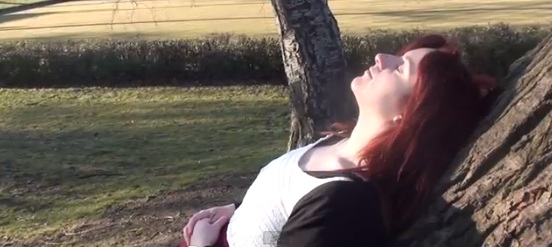
I decided to also challenge media conventions in my work, as this will allow my video to be alternate and fit to a niche audience as well as a mainstream audience. The niche audience is the 18% of my audience that took my demographic poll on my blog - they preferred abstract music videos and 13% preferred animated music videos. To challenge media conventions I first had to film an extreme close up shot of the artists face, therefore the continuity will be smooth and the audience will hopefully be able to understand the connection from the extreme close up to the shot of the sky. Filming an extreme close up also brings more emotion into the song as we can see her facial expression, her eyes seem in a daze as though she's trying to figure something out.
Extreme close up

I used a POV shot in my video, which you rarely see in a indie/pop video as they are usually either focused on the artists body/face or quite fast. I thought it would add a alternate touch to see from the artists eyes as it will also make the audience feel more involved in the narrative as they will be seeing what the artist is seeing. I think the POV shot relates well to the extreme close up shot as she looks confused, and then the POV shot is spinning round, connotating she's lost and trying to figure something out.
POV SHOT

I also used a lot of continuity editing in my video so the camera shots went in a correct sequence. For example, below I used a medium long shot then a medium close up, then a close up, then an extreme close up - it's unconventional to go from a close up to a long shot to a extreme close up and I wanted to stick with conventions for shots like this as the song tempo is andante - which means slow but not moderately slow- so I want the shots to follow each other smoothly.
Medium long shot

Medium close up
Close up

Extreme close up

I also used the convention of breaking the 4th wall and allowing my artist to look directly into the camera showing she knows she's being filmed and making contact with the audience. I took this inspiration from Never Shout Never's video where Christofer Drew is sat on the park bench and looking directly at the camera. I also used his inspiration of controlling what's going on in the video. He holds up a sign which initially says 'Hello' but he covers up the 'O' to fit and relate to the lyric, 'You know you're life is such a hell, you wake up early and you work until...' .In my video I decided to take a similar approach but in a more physical way. I directed my actor to touch her belly and move to the middle of the bench, and then do it again and move once again. I then edited this so each action fit with the beat of the music, showing that my artist is controlling what's going on in the video.
Christofers...

My artist giving eye contact...

My artist taking control of the music video.


Example:
MISE EN SCENE CODES AND CONVENTIONS
After already researching into a few artists, I had also took into consideration the costumes they wore. I did some more research on the artists which inspired me the most, and followed the mise en scene conventions they had used.
I have used three costumes in my music video as I didn't want the costume change to be too overwhelming, yet too simple. The ideology of the costumes was that the white dress and black cardigan at the beginning was when my artist was going into her 'dream', when the camera cuts back from the guitar scene my artist sits up and has a dark pink maxi skirt on with a white top and black cardigan. The third costume is the red dress and black cardigan which is used for all the guitar instrumental scenes. The only costume I kept my artist in in each costume change was the black cardigan, I wanted this to be the thing the audience would relate the artist to and notice it's her in each scene, being a key piece of mise on scene in my music video.


Stacey fit perfectly into the indie pop stereotype. In her music video she is wearing a creamy lace vintage inspired dress and is located in a nature environment. She also has a flower headband in her hair and her hair has a messy indie look to it. Her cream dress inspired the opening scene to my video when my artist is laid in the grass. Unfortunately I had left the flower head band I had purchased especially for the video at my dads house when the filming took place. Although it's not far from me I didn't want to lose any day light as it was a really sunny day perfect for filming and the ideology of that I wanted my video to include, so I worked with what I had as it wasn't too much of a massive deal in the video.
I also took inspiration from Beyonce's video as it's very angelic and innocent, I also think the white wedding dress she wears brings sophistication and elegance into the video making it look very classy, which I wanted to convey at the beginning of my video. This is another reason why I used a cream lace dress at the start of the video.
I also took inspiration of mise en scene from Miley Cyrus' cover of 'Lilac Wine'. She wears a lace cream top and a black maxi skirt, I think it looks really sophisticated and girly, which fits with the indie pop theme of my music video. I like how the skirt flows around as it looks really delicate which is the image and ideology I wanted to convey in my music video. I however didn't want to use a black maxi skirt as I felt pink would be much more girly and fitting with the ideology of the song and black would lower the mood of my video.
LOCATIONS:
Throughout my research and looking at stereotypes, I noticed a lot of the scenes are filmed in a nature environment - usually on a sunny day. I wanted to use this convention in my own video as it not only fit with the song to my video, it helped the Indie sterotype be conveyed in my video which I explained earlier.
I decided to go on scout for locations and luckily there was some perfect locations in my area. I wanted the first few scenes to take place in a field like environment, I decided to use my backgarden for this as it was big enough to film in and would be easy to access.
I wanted my video to be filmed outside so the next location I was looking for was some streets. Luckily, I had just recently moved into some newly built houses. I felt like these were perfect for my video as the bricks have been painted white and they look really well done up on the exterior instead of filming down a street which had old houses.
Next, I wanted to film at a park. Once again I luckily lived 5 minutes away from West Park. I had been there before so knew what it looked like, but decided to take a visit before making a final decision in case I realised it wasn't the environment I had in mind. When I went to visit it I knew it would be perfect for my video. West Park has some long paths with tree's at each side that look really nice in the sun light as the brances and leaves meet in the middle and create a pretty environment. It also has some nice things in the park which I could film on like swings and slides.
Here is some photos of my chosen locations which I have also annotated.
PROPS:
As my song is an acoustic based song, I felt it was crucial to have some sort of acoustic instrument featured in it. Initially I planned to use both guitar and piano as I have guitars of my own and my dad has a piano at his house. I thought about using green screen so my actor could 'walk' on each key of the piano as it went down - however I wasn't quite sure how I'd do this as my actor would need to be very precise when walking or it wouldn't be in time so I decided to leave this idea.
I used my acoustic guitar in the video for the introduction parts and a scene in the middle. I learnt the introduction myself as I wanted it to be as accurate as possible and didn't think there was any point in making my actor learn a song if I could play guitar myself - I knew that my face wouldn't be included in this part as I wanted it to switch between close ups to extreme close ups at different angles so using myself wouldn't be a problem. However, looking back I don't think it would have mattered that much who had played the guitar or even if they'd played it exactly right as when I addd the rotoscope animation over it was quite hard to notice when the changes on the chords or the strings where - nevertheless I'm glad I filmed it this way just incase the rotoscope hadn't worked as I'd of needed to re shoot alot.
I looked for the 'Neopolitan Dreams' tab online, and started learning the intro riff to it, it was really easy to do as it was such as simple riff.
The guitar tab:

I also had seen Ellie Gouldings video 'Figure 8' where she is featured laying on a white cover. I liked how this looked as it reminded me of someone waking up into a dream which is the message I wanted to bring at the start of my video. I also thought using a cover in the middle of a 'field' would bring confusion to the audience as to why she's randomly woke up in a field - suggesting she's in a dream.
I also decided to use this shot and prop because I took inspiration from 'Back To The Future' once again. In some scenes when something confusing happens or makes them think the non-diegetic 'twinkle' sound is played in the video.
When listening to my song it has a chime twinkle sound at the beginning also, which I thought could relate to the BTTF sound giving the ideology she's in a dream and a confusing scenario has happened.
Another prop I used during the process wasn't used for filming, it was used for my digipak. I used a chair as I was inspired by Ellie Gouldings magazine advert/digipak photo which I will later explain more about.
Props I used in my video:
Music Video Forms.
Challenging the codes and conventions of indie pop music video forms:
There are 4 music video forms; abstract, animation, performance and narrative.At the start of the course I did some more indepth research into each form and looked at the different music videos. This gave me an idea of how the different video styles looked compared to the song they was used with.
I wanted to try challenge the indie pop video form conventions and have animation in my video instead of the conventional performance or narrative style video - this would be challenging but fit with the indie 'individual' 'non mainstream' stereotype. I wanted my video to be quite abstract and the have a narrative but a narrative which wasn't completely obvious to the audience so they could have different opinions on what the story could be about. I took this inspiration from Lisa Mitchells narration idea for the song, she says in her video she's talking about parting from someone, but she doesn't directly say who it's about.
This is what Lisa said her song is about:
"I guess it stems from a parting of two people, obviously me and someone else," says Lisa of the song. "That's where the spirit of the song came from, but then it moves into a place of like, not having such a clear idea of where you're headed. But then when the refrain comes in, the 'ba-da ba-das', it's like saying 'there's so much going on, but hey, fuck it, we're just gonna have fun'."
The most dominant way I challenged conventions is by using rotoscope animation in my video. Rotoscoping is a form of animation, you take recorded footage and draw onto each key frame. Usually in pop and indie videos rotoscope and animation isn't used often, however it is getting more popular in the post modern era as new technology is avaliable and it is much quicker than years ago when you would need to hand draw the animation.
I first needed to actually research into the different animation routes I could go down.
I did some in depth background history on various animation techniques such as rotoscoping, 3D animation, stop start/traditional hand rendered animation, pixilisation and CGI animation.
http://rubyrogersa2media.blogspot.co.uk/2012/11/animation-research.html I also tested out the more harder techniques so I could get a grasp of how time consuming they were and what programmes I would need to learn - such as Flash Animation or After Effects.
After testing a few out I still wasn't sure - I created more research but this time looking at media text influences. I compared videos such as Never Shout Never's What Is Love?, the film 'Juno's opening sequence 'All I Want Is You' which transitioned into rotoscope, and A-Ha's - Take On Me - this ended up being a huge inspiration to my video along with Juno opening sequence. I really like the whole rotoscope process and the way the film Juno had used reality with rotoscope which gave it an individual look to it.
Media text influences: http://rubyrogersa2media.blogspot.co.uk/2012/11/media-text-influences.html
A-HA- Take On Me was a huge inspiration for my video as it used a mixture of rotoscoping with reality which was the effect I wanted on my video. I liked the raw-ness of the video as it wasn't really detailed drawings on each frame - it inspired me to be sketchy in my video which gives it a unique effect. I also liked the fact reality and rotoscope are used together, I feel like this really sets the video apart from others. I watched the video many times and thought up some ideas how I could do it. Rotoscope isn't conventionally used in Indie Pop videos so this was challenging the audience aswell to see what their expectations would be for this song and also the opinions they had on it. The video also inspired me to stick to using monochrome colour throughout the video which reminded me of a comic book.
http://www.youtube.com/watch?v=djV11Xbc914 (would let me embedd it)
Rotoscoping the guitar at the start helped the narrative as I think it showed more that she is going into a dream/fantasy world as the guitar gradually turned to animation and then monochrome.
After looking at many different media text inspirations whom have used rotoscope animation, I started to focus on a few main medias.
A-HA- Take On Me was a huge inspiration for my video as it used a mixture of rotoscoping with reality which was the effect I wanted on my video. I liked the raw-ness of the video as it wasn't really detailed drawings on each frame - it looks sketchy which gives it a unique effect. I also liked the fact reality and rotoscope are used together, I feel like this really sets the video apart from others. I watched the video many times and thought up some ideas how I could do it. Rotoscope isn't conventionally used in Indie Pop videos so this was challenging the audience aswell to see what their expectations would be for this song and also the opinions they had on it.
2. How effective is the combination of your main product and ancillary texts?


I think my ancillary texts and media video work well together using cross form synergy. To make sure my products all had the same key features, I have used rotoscoping/drawing in all of these, to give it an original unique DIY indie look to it.
MUSIC VIDEO
DIGIPAK FINAL

Front cover

CD right

CD (DVD) left

Left inside (image)
Right inside (booklet)


I created my website homepage, magazine advert and digipak along side my music video throughout the process, this meant the whole time I was updating and changing my music video, I was making necessary changes to my ancillary texts too to make sure they looked similar.
I noticed on artists website they sometimes fit the background theme to the current album they have released - I wanted to carry this onto my website as I thought her fans would be able to easily relate all the products together. I found a theme on the Wix website I used that was meant for a recipe style website - however I changed this alot to fit to my music video. The theme has a blue background with cartooned clouds that I thought fit well with the chorus section of my music video that's been rotoscoped. I kept this blue, white (and occasionally pink) angelic themed housestyle throughout all my products so continuity would be the same throughout and not be misleading to my audience seeing lots of different colours and styles in each product.
To get inspiration for my photo-shoot I analysed a few digipaks and photos from digipaks that was under the Indie Pop genre. Doing this helped me a lot as I could take inspiration from the codes and conventions used, aswell as thinking about the ideology of my digipak and how I wanted the artist and the audience who purchased this to be portrayed.
SHORT LIIAR ANALYSIS OF PRODUCTS (LANGUAGE, INSTITUTION, IDEOLOGY, REPRESENTATION)
INDIE/POP ARTIST FRONT COVER RESEARCH
Lisa Mitchell

The image on this photo uses an establishing shot, this helps us recognize the location of the artist, she is placed in the left third of the photo showing she's not the main importance, this is an unconventional code as usually the artist dominates the page. I can see she is dressed in black white connotes dominance, which is also enhanced more as she's leaning out the window almost as if she's looking down on us. The colours on the cover are very nature based, suggesting the audience for her music are indie/hippies. The text is placed at the right third of the photo which is very dominating showing the album and musics importance. The institution of this album is Scorpio Music. I think the ideology that is trying to be conveyed is the fact her songs are quite peaceful and are inspired by nature as there is a lot of nature dominating the cover. I think she is also trying to play up to the indie stereotype as indie is seen as being very individual and wear dark vintage clothing - which she is doing. I think once again the cover is trying to represent the audience as being young female teenagers who are going out into the wild world experiencing life. I think this because she's leaning out the window and is surrounded by nature. I also think she's trying to convey the audience as being a niche, individual audience as the cover doesn't use codes such as medium close ups with the artist dominating the cover.
Ellie Goulding

The cover uses a long shot, however is quite close so we can see her full body. The camera is on a very slight low angle, showing she's powerful and trying to undermine the audience. Ellie is also breaking the 4th wall by making eye contact with the audience, however this helps the audience feel more involved with the media text. The background is very nature based showing individuality. Ellie is positioned in a very posed way as she's almost leaning towards us with her legs apart showing a seductive language. Ellie seems to be dressed quite casual but has a twist to her outfit as she's wearing heals once again showing individuality. Her clothes are very girly as she's wearing a white blouse with brown high waisted shorts, this can be seen as controversial as white signifies pureness and innocence, however as I mentioned she is sat in a seductive pose, showing the audience could be quite rebellious. I think she's trying to target a male and female audience aged between 16-24, this is because the pose she is using could target the male audience, but the style of fashion could draw in the female audience. Her audience could be seen as rebellious due to the controversial ideology which is being portrayed, and fashionable because of the up to date clothes she is wearing. I think she is trying to target a mainstream and niche audience as her music is heavily pop based with the occasional indie twist, therefore the mainstream audience will be interested in her music. However, I think the language of this cover could be trying to target a niche audience as the props and scenery used isn't very popular to a lot of artists.
Rilo Kiley

The photo uses a medium close up which allows the audience to clearly see the artists facial expression and emotion they are conveying. In this example the artist looks quite calm and neutral. The drawing is clearly unconventional as it's not a usual code to include drawing in album covers. The pastel colours make the album look quite angelic and individual compared to some albums which are too bright and in your face. I think the typography works well with the photo as the photo is drawing based, and the typography looked hand rendered which shows continuity in the album.The artist is looking away from the camera showing he's distracted, this is an unconventional code as usually artists are focused on something or looking direct into the camera to show power. I think the album cover is trying to convey individuality which it's doing well as the style of photo isn't often used on album covers. I think they are trying to represent the audience as being part of a niche audience which makes them individual. The audience may also be an active audience which keeps up to date with new technologies (such as animation). The audience could also be the younger audience ages 16-24 as they may be more attracted to the cover as it's a lot more individual than others. The album doesn't give much more representation of the audience as it's such a simple cover, this may be because the artist wants a broad approach to their music and let the audience decide what they want to be represented as. I think the album is also trying to draw you in to listening to the music as if the album is so individual, what could the music also have to give to the audience? I personally hadn't listened to Rilo Kiley before coming across this album and was quite suprised when I listened and saw the video Silver Lining. I thought the singer was going to be male, but Rilo Kiley is actually a band with a female singer. I think this could be a good technique to use in the music industry as it makes the audience wonder what sort of music could be on the album and could be suprised in a good way.
Another Rilo Kiley example...

Rilo Kiley - Silver Lining.
I then took photos for my products based on this research I had gathered. I used props such as a guitar, a chair, a white cover, and some spare fabric I had been using for my college textile project.
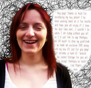
Throughout the process of creating my digipak I created many different drafts. I started off by using the medium close up of my artist I had took whilst she was laughing during the photoshoot. I used this photo as it was very natural and portraiyed her in a positive light. I decided to rotoscope her to fit with the animation theme throughout my video - I also changed the background on this so it would stand out. However, throughout recieving audience feedback I came to the conclusion it wasn't working and didn't fit with my other products.
Here is a link to the process I went through to create the final draft of my digipak.
http://rubyrogersa2media.blogspot.co.uk/2013/04/digipak-drafts-process.html
My final digipak cover is very simple but I think it's quite effective. I took inspiration from simple digipak covers such as Sia and Never Shout Never:


This is what inspired the rest of my products to use rotoscope and the blue and white theme. I like how my cover has turned out as I think it's unique and will stand out to the audience, it also uses rotoscope so the audience will recognise it straight away from the music video.
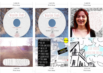
For the CD part of my digipak - I once again used a still from my video, I chose the point where I used a POV shot of my artist looking up at the sky. I liked this shot as the brances and leaves where all in a sort of circle in the sky - giving me enough room to have my CD designs in the middle where the sky was. Another reason I chose this image is because it followed the house style of using blue and white, whilst also fitting with the indie 'nature environment' stereotype.
For the actual CD's I decided to create the same design, but create one CD for the music, and one DVD for extra features such as behind the scenes footage. I did some background research on what needed to be included on the CD by looking at pre made CD's from Beyonces work and a general CD I found on Google.

+(CD).jpg)
I then applied this info to my own CD and DVD...

For my magazine advert, I used the same image but slightly changed the text. I didn't want to enlarge the image as it was square and changing it to rectangle would mean stretching it and loosing photo quality. I took the original image that had no text written on it and placed it in a blank A4 sized file. I then followed the conventions I had researched and placed a solid shape underneith, this filled the page and allowed me to write the main text in this section. I decided to write the artists name in the middle of my original image where it says 'LISA ROGERS NEOPOLITAN DREAMS' on the digipak. I thought I could write the album name under the image so it would stand out to the audience and not be squeezed in as when the image would be enlarged on a magazine advert the text would have been really small and I wanted it to catch the audiences eye instead of having to search for the artists name and album name on the magazine advert. I took this idea from Jessie J's magazine advert, her name is placed on the image but in the section below is the album name in large letters that will attract the audiences attention. I used the same font on all my products so continuity ran throughout them all, I also chose this certain font as it came under the 'handwriting' section on DaFont.com which related to the whole rotoscoping/hand drawing idea in all my products.
Jessie J's magazine advert.

Ellie Gouldings magazine advert.

3. What have you learned from your audience feedback?
Prior to receiving audience feedback, I first needed to establish my target audience. At the start of the course, I created a poll on my blog - this consisted of various key audience terms such as:
Qualitative Data: Personal questions that can be asked in interviews and the feelings of the audience.Quantitative Data: Collecting frequencies through surveys and questionnaires.
Psychographic Data: Looking at personality, values, attitudes, interests, and lifestyles of the audience.
Demographic Data: Characteristics of a human population as used in government, marketing or opinion research, or the demographic profiles used in such research.
I also took into consideration the different social classes of my audience.
A- Upper class (Doctors, managers)
B- Middle class (administrative/ professional)
C1- Lower middle class (Junior managerial/professional)
C2- Skilled working class - (Manual workers)
D- Semi-skilled and unskilled manual (builders, factory workers, store employees)
E- Casual labourers, state pensioners, unemployed & students
I let my audience vote for a few weeks and then read back through and worked out the highest percentage on each question as this would be the audience I needed to target. I took into account the chosen genre and based all the information around this. Here is my audience/reader profile. I included social networking site images such as Facebook, Twitter and Instagram and made the image very girly by using reds and pinks to show it was targeted at dominantly females.

As I wanted my video to be as planned out and accurate as possible, I decided to get audience feedback from the moment I started filming. My actor who starred in my video was also a Media student at Wyke, so I thought her opinions would be quite strong and constructive. If I wasn't sure about a certain camera shot once I'd seen it in reality instead of the moodboard and anamatic, she put her opinions forward on what I could do to improve the shot (...and wasn't scared to say what she thought as she's my sister!).
For one scene, I originally planned to film an over the shoulder shot of my actor walking round the corner of the street, however, once I shot this I realised it looked very unprofessional and too wobbly as I was filming in handheld motion. Whilst trying to come up with ideas my sister gave me the idea of filming her walking down the street (the end shot). I originally had planned a shot like this for the end but in my head I'd planned to track her movements down the street and follow her walking at the end. However, my sister made a good point that the shot would look better from a high angle. Very luckily, my mums bedroom window was directly opposite to another street which had a long path. Filming from her bedroom window was a good choice as the shot looked much more professional and neat as I used a tripod. Audience feedback from my actor helped a lot in filming as I'd of had to try out a lot more shots before thinking of that shot if she hadn't suggested it.
Throughout the process I created various audience feedback sheets where my audience could write as much as they wanted on it on my products and how I could improve. I tried to do this after each major change on my products so my audience were always up to date with the change and could point me in the right direction. I also transferred some of these audience feedback sheets into GoAnimate's to make them more interesting to listen to.
(examples)
When finalising my video I took some audience feedback verbally and then asked them to write out their opinions on a sheet of paper so I could transfer this to a GoAnimate. The majority all pointed out the same thing about the colour differences in clips in my video.
Audience feedback Simon audience feedback simon by s0013481 on GoAnimate
Animation Software - Powered by GoAnimate.
Audience feedback Charley audience feedback charley by s0013481 on GoAnimate
Animated Presentations - Powered by GoAnimate.
RGB Colour Correction.
Looking back at the footage I had, I noticed that the audience feedback was right and some shots looked dull whilst others where bursting with sunlight. To try change and even this out, I used Premiere Pro's 'video effects' and 'effect controls' to alter my video. As my video was filmed in full HD, the video quality stayed more or less the same.
Before:

After:


My audience feedback taught me that it's crucial you get as many opinions as possible on your product, a small mistake you might not see may be so obvious to others. It also allows general opinions on my product - not everyone likes what you like so allowing me to listen to other opinions gave me ideas that I could interpret into my work to improve it and satisfy the audience's needs. Another thing audience feedback taught me is that you need to experiment A LOT before you are satisfied with your products and audience feedback makes it all the much easier. For example, as I mentioned about the filming in the street, I had to experiment a lot until I was happy, but my actor putting her feedback forward made it more simple and straight forward. I also think audience feedback is especially important in media as you're trying to sell a product to your audience, not your self. The audience knew the stereotypes that was trying to be met and they can help you establish these. This is why it's important to collect opinions, the audience knows what they like and if you're product isn't providing that, no matter how much you like your product, if the audience don't like it they won't buy it. I experienced this with my digipak cover. I liked the idea of having my artist rotoscoped with a pastel background behind her with the writing to the side. However, my audience didn't think it looked good and thought it looked quite scary as I did it on Photoshop with the different colours on my graphics tablet. However, because I'd been working on it for so long and looking at it for so long, I didn't really notice what they meant and was adamant on trying to change the drawing slightly to make it less scary, instead of actually changing the idea altogether to please them. I eventually realised that the cover did look quite off putting and that my audience was right and needed to listen to their opinions to give my product it's full potential, therefore changing my idea - which I'm definitely glad I did!
At the end of the project, I decided to take one last audience feedback to see if I'd met the audiences needs and expectations. I created a survey on www.surveymonkey.com and put together a variety of questions for my audience to answer, from leaving comments to rating my products over all.


Feedback

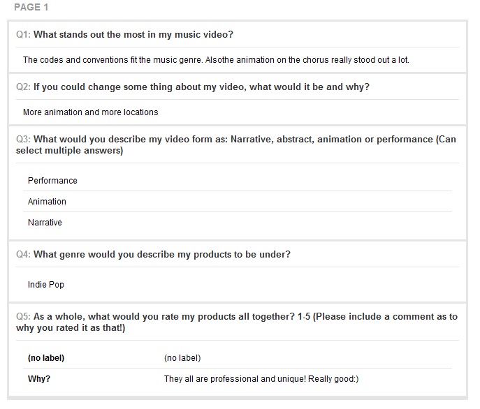


I used the analyse results feature to see the results of some questions in a chart format.
Here is some more of the audience feedback I received once converted into a chart automatically through the website.


I asked some questions on my survey such as 'what stands out the most' and 'what would you change'
The audience left comments on these questions and pointed out they liked the animation in the chorus when my artist touches the wall and everything turns animated. I think this is the strong point of the video and the part i'm most pleased with. A few other comments mentioned the effect I used when I filmed up to the sky and then when the camera tilted back down it was a different scene. A lot of the comments also mentioned that I should of included more animation, which I agree with. The average rating for my products all together was 4.63. 37.50% rated my product 4 stars and 62.50% rated my video 5 stars - which meant no one thought it deserved less than 4 which I was happy about.
However, i'm happy with my overall audience feedback for the final products and the fact the audience could recognise the genre and relate all the products together because of the house style and continuous theme throughout. I'm glad the audience could appreciate the amount of work that went into rotoscoping and the fact it was supposed to be quite sketchy. I know my video has faults such as the lack of animation due to some files being corrupted, however I'm happy with the overall outcome.
4. How did you use new media technologies in the construction and research, planning and evaluation stages?
Question 4 by s0013481 on GoAnimate
Animated Presentations - Powered by GoAnimate.
New media technologies made a huge difference in the entire process of creating my music video and ancillary texts, this is because they are quick and easy to use, up to date and available from almost anywhere if you have a phone or WiFi. I used a variety of technologies such as; Blogger, Adobe Premiere Pro, Adobe Flash Professional, Adobe Media Encoder, YouTube, Mobiles, Adobe Photoshop CS6, Graphics Tablet, and many more which I will discuss.
Research & Planning:
As I needed somewhere to store my research and planning I needed a place that was available on the go through technologies such as the internet and my mobile, I chose to sign up to Blogger - this allowed me to constantly post ideas and save as drafts to later neaten up. It was really helpful as I can add other medias such as html embeds, photos, text and much more to organise all my work.
The internet was also obviously the main media I used in my research, it allowed me to do so many things and use other new medias through the internet. For example, if I was doing this project without the internet I'd not have come across 'Flash Professional' which was the editing programme I downloaded off the Adobe website to edit my rotoscope animation with. It also allowed me to research into existing music videos, digipaks, websites and magazine adverts within minutes.
Photoshop and Windows movie maker were also a helpful medias in the research side of my project, they allowed me to bring my ideas to life and see how they would look by creating digital mock-ups (for my digipak and ancillary texts) and also create a storyboard anamatic for my music video to get an idea of the timing and what the shots would look like. To create my anamatic I cropped the images off my storyboard using Photoshop, and then imported them into Windows Movie Maker. I added the song and placed each image according to the lyric I had annotated on my paper story board. Creating the anamatic allowed me see what my ideas would look like in movement with the music. My ideas changed and developed through the process meaning some parts of my storyboard weren't actually there in the final music video - however, these changes were positive changes and made my music video a lot stronger than if i'd stuck directly to the storyboard.
Question 4 by s0013481 on GoAnimate
Animated Presentations - Powered by GoAnimate.
New media technologies made a huge difference in the entire process of creating my music video and ancillary texts, this is because they are quick and easy to use, up to date and available from almost anywhere if you have a phone or WiFi. I used a variety of technologies such as; Blogger, Adobe Premiere Pro, Adobe Flash Professional, Adobe Media Encoder, YouTube, Mobiles, Adobe Photoshop CS6, Graphics Tablet, and many more which I will discuss.
Research & Planning:
As I needed somewhere to store my research and planning I needed a place that was available on the go through technologies such as the internet and my mobile, I chose to sign up to Blogger - this allowed me to constantly post ideas and save as drafts to later neaten up. It was really helpful as I can add other medias such as html embeds, photos, text and much more to organise all my work.
To start my research I used the internet which was so quick as I could find out something about an artist within a few seconds. I looked at a variety of music video genres to decide which I wanted to focus on
such as; animation, abstract, narration and performance which I have shown here...
I also used the internet to do in depth research into animation history and techniques which I could use, this is how I came across rotoscope animation which is what I used in my video and ancillary texts.
Using Prezi allowed me to store all my ideas and research quickly into one place whilst also comparing and contrasting them. I could also annotate my ideas easily along side this. Prezi definately helped me to be more organised and take control of the way I wanted the audience to look at all my research by using arrows and editing the path. Having the media Youtube avaliable to use also enabled me to quickly have access to a variety of music, videos, and tutorials constantly on the go. Youtube was helpful in this way as I could research into different music videos without having to search through music channels finding inspirations for my own video, I could easily just replay the video as many times as I wanted to. I also used Youtube to look up other media texts which inspired my video. Although 'Back To The Future' is a film, when watching it I saw a scene which I thought may work well in my video. Time in example video 2:20 - 2:50 seconds. We see a match on action shot, the Doc looks up at the town clock (we assume), and then the camera cuts to the tower which is a POV shot. However, the camera then pans down and we see a different scenery to fit with the year (1985).
Example video.
In my video I tried to do the same thing but not actually cut the camera at all until the camera was focused on a solid blue spot in the sky. Once I was at my next location I started filming from the sky and panned down to the park - creating the illusion of the scene quickly changing. To do this I simply added an effect in Premiere Pro called 'dissolve' this smoothly blends both clips together and looks more natural as the sky in each scene is blue. Time of this scene in my own video 0:41 - 0:56 seconds.
Youtube also made it possible for me to research into lots of music videos and look at the codes and conventions in each. It also helped me see the different video forms avaliable such as narrative, performance, abstract and animation to decide on which I wanted to pick for mine.Photoshop and Windows movie maker were also a helpful medias in the research side of my project, they allowed me to bring my ideas to life and see how they would look by creating digital mock-ups (for my digipak and ancillary texts) and also create a storyboard anamatic for my music video to get an idea of the timing and what the shots would look like. To create my anamatic I cropped the images off my storyboard using Photoshop, and then imported them into Windows Movie Maker. I added the song and placed each image according to the lyric I had annotated on my paper story board. Creating the anamatic allowed me see what my ideas would look like in movement with the music. My ideas changed and developed through the process meaning some parts of my storyboard weren't actually there in the final music video - however, these changes were positive changes and made my music video a lot stronger than if i'd stuck directly to the storyboard.
Production:
Music Video:
Before filming, I created a risk assessment sheet. I analysed all the risks that were included in the filming process and made sure I knew what precautions to take in-case of an emergency - however, the risk assessment list is very minimal as my video didn't have much 'risky' content to it. I also made sure I had everything ready for filming so double checked using the final checklist I created.
.JPG)

During the production I filmed with a Full HD Sony HDR - CX115 Handycam.

I decided to film with my own camera as I would have it available whenever I needed it instead of having to book one as a lot of people wanted them at the same time. I also decided to use my own camera as it filmed in full HD at 1080p so I knew it would be good quality. Whilst filming I used my iPhone 4 to play the song back that I had stored for my actress to sing along to so it would be exactly in sync instead of her singing it from memory. I also had the lyrics available on my phone incase she forgot them. Using my phone was very useful in production as it was portable, had a long battery life, and was loud enough for the actress to sing along to. I also used YouTube on my phone during production to view the anamatic I had produced as I didn't want to carry the paper version around incase it got crumpled, lost or ripped. I also used a tripod to film some scenes with in my video which I borrowed from my sister, as once again, it was more convenient using the technologies and devices I had available rather than having to wait for people to film.
Ancillary Texts:
To take the photos for my products I used my iPhone 4 for most photos and some a Canon EOS 650D that I borrowed off my friend, however I gave her it back and didn't end up using it again for any photos as I was happy with the quality and composition photos I had. I used my iPhone 4 as it was high quality and took photos in 5 megapixel quality.
To take the photos for my products I used my iPhone 4 for most photos and some a Canon EOS 650D that I borrowed off my friend, however I gave her it back and didn't end up using it again for any photos as I was happy with the quality and composition photos I had. I used my iPhone 4 as it was high quality and took photos in 5 megapixel quality.
Construction:
Music Video:
When my shots and scenes were finalised and were ready to be edited, I used Premier Pro, an editing suite designed to quickly and effectively edit media clips and photos into a composition where you can then add effects and titles. Premiere Pro was relatively easy to use as I'd worked on editing suites in the past. Before starting the rotoscope side of the editing, I needed to align the clips and make sure they was in sync with the music. To do this I dragged the clip to where the artist started singing, and then used the razor tool to trim the video where there was unnecessary or empty footage that didn't need to be there. I zoomed right in to my clips so I could try align the video and song as accurately as possible, however it proved quite hard to do in some scenes where my artist is moving alot - such as the scene when she's on the swing, the light and movement made it quite hard to see if it's in sync. To check my clips where in sync I un-muted the video sound and played both clips together to see if the sounds matched, this made it easier to align the clips and make them in sync. I then muted the video clip and checked they were aligned as best as I could - although this was quite time consuming and I needed to try speed up my process as I still had a second amount of editing to do - the animation. I used quite a few effects in Premiere Pro which I originally didn't think I would. For example, I changed the opacity on the animated guitar clip to 60% and placed it on the Video 2 layer, therefore you'd be able to see the artist in the background and the guitar clip slowly fade in from a lower opacity. I did this because I thought as the guitar was acoustic and the sound slowly built up, using this effect would make my video have a softer feel to it instead of harshly cutting to the next clip.
I also decided to try enhance the sunlight colour on my video as I took some audience feedback which told me that continuity kept breaking between clips as sometimes the sun was really bright - and then sometimes it was quite dull. To try change and even this out, I used Premiere Pro's 'video effects' and 'effect controls' to alter my video. As my video was filmed in full HD, the video quality stayed more or less the same.
I also decided to try enhance the sunlight colour on my video as I took some audience feedback which told me that continuity kept breaking between clips as sometimes the sun was really bright - and then sometimes it was quite dull. To try change and even this out, I used Premiere Pro's 'video effects' and 'effect controls' to alter my video. As my video was filmed in full HD, the video quality stayed more or less the same.
Before:
After:
There is a scene in my video where I tilt the camera up to the sky, and tried to make sure the camera landed on a solid blue patch in the sky. Once I was at the next location (West Park) I asked my actress to sit on the park bench and then I started filming from another solid blue patch in the scan and slowly tilted the camera back down and filmed her sitting on the bench. This gave the illusion that the continuity hadn't broke and she'd somehow moved to a different location. However, without using effects I noticed the clips sort of cut as they wasn't exactly the same shade of blue. I decided to add a 'dissolve' effect to this to make the two clips dissolve into each other more smoothly. I went to the effects panel again and looked under the video transitions effects. I found the dissolve effect quite easily and simply dragged it across in between the two clips. I think the effect looks good overall however it's not perfect as it's still a little obvious that the video cuts.
Another effect I used in Premiere Pro was the 'fade out' effect, once again under the same effects panel This was quite easy to add as I could set a starting point where I wanted the video to start fading and then where I wanted it to end. I could also chose the opacity of the fade which helped a lot as I wanted it to start fading really lightly and gradually turn fully white.
Overall, Premiere Pro was really easy to use and helped me a lot as it could edit footage really precisely instead of only allowing you to crop the video a certain amount.
I also used another editing programme by Adobe called Adobe Flash Professional CS6. This was the editing suite I used which allowed me to rotoscope my video using 'Keyframes'.
I'd heard of the editing programme before, but never actually used it so I first looked at some YouTube tutorials to try get the hang of it.
http://www.youtube.com/watch?v=up9UbSndNO4
I also researched on forums and through Google to know more in depth research about the settings I'd need for my video and how to convert my AVI file to a FLV file.
I first thought the task in hand may be quite difficult to grasp, however I was quite excited to start editing and see how all my ideas would look once put together.
Before I could start rotoscoping, I needed to install another Adobe programme called Adobe Media Encoder. This programme allows me to convert my video into a FLV Flash file, Flash doesn't let you directly import AVI or MOV etc files, therefore it needed to be encoded.
First, I needed to export the section of the video I wanted to rotoscope. I didn't export all of the video as this makes the Flash file crash and takes up too much memory so the Flash file can sometimes corupt when trying to export it. So to select the section I wanted to rotoscope, I used the little yellow bar on Premiere pro to drag the bars to each end of the clip I wanted to export. I exported my video in sections such as the chorus section, then the car section, then the guitar section. Doing it in this process helped me to be more organised with all my files.
To export the seletection of video I went to File > Export > Media and clicked 'match sequence settings' so everything was at the right settings. I also made sure 'export work area' was selected so that it didn't export the whole video.
I then needed to use ADOBE MEDIA ENCODER to change the format of the video to a FLV Flash file.
I selected the video I wanted to encode and looked for the FLV Flash video setting making sure it had 'match source attributes' selected. I then pressed the encode button and it was done!

I created a new file in Flash also known as the 'Stage', I made sure the stage was also set to 1080 x 1920 like my footage was so none of the video would be cropped out of the stage.
Flash made it so much more easier than hand rendering drawings - this is because it imports the video frame by frame so you can adjust each one as you go along.
I started off by creating a new layer and naming it rotoscope. I did this so I wouldn't be drawing over the actual video footage, but a new layer so I could easily rub out or make any changes without rubbing the video out. I made sure I was always clicked on the video layer when drawing.

I then right clicked on the frame which I wanted to start drawing on, and clicked 'INSERT BLANK KEYFRAME'. Adding a key frame meant the drawing would only be applied to that certain frame, and not be floating in the same place when the video was played through.


To draw with I used a graphics tablet with the pen it came with. I hadn't used it much before so was worried if it would be easy to use, and it definitely was. Once I got the hang of it I could draw easily on my key frames.
.JPG)

I also hid the video layer to see what the rotoscope would look like without it and played it back, which I also liked aswell.

Another test that will be carried on for my final outcome.
In my video it was 25 frames per second, which meant the task itself was very tedious as it took hours just to rotoscope and animate a few seconds on footage, however, when looking back it was worth it as the more frames you use, the smoother the animation looked.
When exporting my video, you were able to chose the type of video you wanted to export it to. This is where all the technical difficulties started to occur. I'd exported my videos in the normal way making sure I compressed the file and setting the correct settings - but sometimes my videos would export with lots of lines across the screen or really sped up. I tried out various available formats to export my video into, and some AVI formats wouldn't even open when trying to play them after being exported. I spent a few days trying to sort the problem which was really annoying as I was wasting valuable rotoscoping time trying to fix it. I eventually somehow exported it in a setting which would play and open in Premiere Pro - as sometimes it would play in the media player, but then not be recognised in Premiere Pro even though it was in the right format. For some of my footage I had to export it and then import it to Windows Movie Maker (if it didn't open in Premiere Pro) and then re export it as a MOV file for it to actually open in Premiere Pro. It was a long process in which I felt like I was getting no where as I'd asked advice off many people but no one seemed to know the answer, I even visited the forum site and various other people had complained about this problem but Adobe insisted that everyone needed to update the programme and it wasn't a fault on their part. Once I tried that the problem seemed to get worse. I'd rotoscoped a section of my video where my artist was playing the guitar reversed (so it looked like she was catching it) and some other important clips that made my video make sense. It took hours to do and resulted in the Flash file to now say Java script error the file couldn't be read when trying to open the file up in Flash to finish it off.
(error message photo here)
Luckily I had a lot of files saved which hadn't been ruined, but I had to rotoscope a lot of the video again, bearing in mind it was getting closer to the dead line day I was starting to panic about my final video as the video itself was based around the animation and I thought if I didn't have the animation included, when my artist touches the wall and nothing happens it wouldn't make sense at all. However, I eventually exported the file into a format that would work but as I said sometimes I still had to export it twice for it to play in Premiere Pro.
Apart from this HUGE technical error in the exporting part of my work, Flash was actually really easy to use in terms of the rotoscoping. I used my graphics tablet that I had to rotoscope with, this was much more faster than using the computer mouse as when you draw on the tablet it goes straight on to the screen so it feels as though you're just drawing on a piece of paper. Using Adobe Flash and Adobe Media encoder developed my skills much further than before. Media Encoder allowed me to understand the technical side of video editing more and understand the different file codes that are needed, prior to this project I had no idea what a FLV file was and what encoding was but now I've learnt much more about these aspects of video editing. Adobe Flash expanded my knowledge of video editing massively, I'd never created animation before so it was a technique I could use and develope in projects in the future. I also had come across 'key frames' before, but never fully knew what they were and how I could use them. Flash enabled me to learn much more about all these features of video editing and the small things that go into creating a video. Creating this project on Flash also made me realise just how much in depth planning needs to go into creating animation and it definitely made me realise more than anything how time consuming rotoscope animation could be.
Adobe Photoshop CS6 was another main programme I used to edit my products. I found Photoshop extremely easy to use as I'd intensely been using it in my media course last year as well as in art and textiles and also when I studied media at GCSE, so I was quite familiar with where everything was which was really useful as I didn't want to waste anymore time since I had lost valuable editing time through the Flash problem.
After researching into music artists website homepages, magazine adverts and digipaks - I'd become familiar with the codes and conventions used in each so was ready to start drafting my own.
http://rubyrogersa2media.blogspot.co.uk/2013/04/digipak-research-and-analysis-of-media.html
http://rubyrogersa2media.blogspot.co.uk/2013/02/magazine-advert-conventions.html
http://rubyrogersa2media.blogspot.co.uk/2013/03/website-research-analysis-of-media.html
After creating some rough ideas, I started to hand draw a mock up and create a digital mockup for my ancillary texts and digipak so i'd have a brief idea of what I wanted my products to look like.
(talk about drafts here)
Photoshop was used to create my magazine advert. I simply imported the original image that I used from my cover into Photoshop. I then decided to not use the same text I had used for the digipak for the main text of my advert, this is because I wanted it to stand out and be really thick, the font I used my digipak is quite thin and wouldn't stand out much on a larger scale. I then added a pastel blue large shape under the square image. I wrote ' DEBUT ALBUM NEOPOLITAN DREAMS' under the image in the blue shape. I thought this looked effective as the album name would stand out to the audience instead of blending into the image i'd used. I then used Photoshop to add text in and information about the album in the shape underneath I stuck to using black white blue and a deep redy pink on my magazine advert as these colours are the main house style throughout all of my products and the audience would be able to recognise that it was the album from my artists music video.
I also used Photoshop whilst designing the website for my product. I looked at a few websites and noticed a lot of them have 'exclusive interviews', I thought this would add a more professional look if I also had my artist starring on a magazine. I then looked back at my AS music magazine and thought instead of creating a whole new magazine, I could just edit my old one and change the mise on scene clothing of my artist to fit what she's currently doing. As my music video was under the rock genre last year, I decided to make up a story line saying that the former 'rockstar' had took a different turn in her life and gone down the indie pop route, I thought this would make more sense instead of having an indie singer randomly being place on a rock genre magazine. To do this I simply used one of the photos I took whilst filming and used the 'lasso magnetic' on Photoshop to crop the background out. I then hid the layer of the current magazine photo and replaced it with the one of my new artist. I also changed the headline at the side from ''THIS IS WHAT I'VE ALWAYS WANTED'' to ''From...ROCKSTAR to POPSTAR''. It was also quite lucky that my artist had dyed her hair since being in my old magazine as I think this makes the whole genre change look more realistic, as in my music magazine her hair is really dark which represents dominance and anger - however her hair is now reddish brown which represents love and sophistication which looks more girly and fitting to the indie pop genre.


I wanted to advertise my products to my audience in a variety of ways, so I imported my products on to different platforms, ranging from iTunes to fake billboards.
To see how my magazine advert would look on a larger scale I decided to use the website http://www.makesweet.com/billboard/ . This allowed me to incorporate my image onto a billboard to see what it would look like.

Here is what my products would look like when promoting them in different media forms:
HMV SHOP

BILLBOARD

bus stop


ITUNES


MAGAZINE ADVERT

Throughout my evaluation I have used a wide variety of digital technologies to explain the processes I went through including embedded YouTube videos, Prezi's, photos, GoAnimate's and www.surveymonkey.com.
I also used the internet to research further into media theorists and what their ideas are in terms of narrative structure. I then put my video in the narrative theory category which I think it fit under.
Vladimir Propp.
Propp proposed that we should classify characters into defined roles based on the functions they do. He said the usual character roles are:The Hero, the villian, the donor (helps the hero), the dispatcher (sends hero on his way), the false hero (falsely assuming role of the actual hero), the princess (needs help from the hero), her father.
Tzvetan Todorov.
Todorov suggests that most narratives start off with a state of equilibrium in which life is normal. The normality is then disrupted by an outside force, therefore either a new equilibrium is produced at the end of the narrative or the previous state of equilibrium is resolved.
Equilibrium > Disequilibrium > New Equilibrium
Roland Barthes.
Barthes suggests the narrative has 5 different codes which the active audience make sense of them.Codes: Action, enigma, symbolic, semic, cultural.
In my music video at the start, the camera is a high angle shot and spins as it slowly zooms in to the actress - *note at this point she has a white dress on - the camera then cuts to the guitar and cuts back to her with a different costume on and her sitting up looking around. The ideology behind this was that she's 'waking up' into an alternate reality dream world, which is where the rotoscope animation comes in - obviously rotoscoping doesn't happen in real life therefore we know it's an alternate reality and not real. This therefore comes under a state of equilibrium being disrupted.
In conclusion, my video not only comes under performance, animation and abstract - it also uses Todorov's narrative theory.
Using Survey Monkey in the evaluation stages of my video allowed me to condone online polls and surveys about my final products. The answers were all anonymous unless you chose to tell your name, this made it easier for the audience to be completely honest about my products instead of maybe feeling pressure to say a certain thing. The website also would automatically work out all the percentages in each of my answers which then made it more convenient for me to see what my audience had voted and commented on in terms of demographics and psycho graphics.
Overall, I'm happy with my final products but feel like the music video doesn't live up to it's full potential. If I had managed my time more efficiently and not had technical difficulties with Flash, I think my video would have been a lot better in terms of animation. Although the process was quite stressful at times I enjoyed creating the video and think the final products were all worth the time and effort that went into making my products!
Subscribe to:
Posts (Atom)